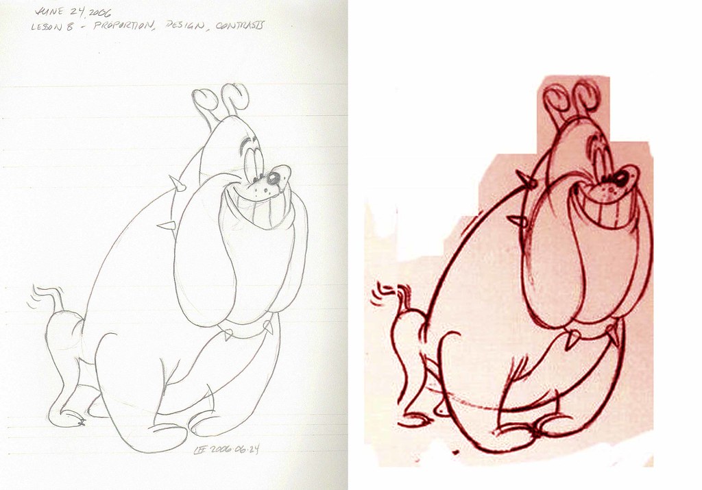
The $100,000 Animation Drawing Course - Lesson 8
(also seen at ASIFA-Hollywood)
Notes:
- I won't bore you with excuses for why this post took so long
- without further delay ...
Bulldog 1

Click here for largest version

Click here for largest version
Bulldog 2

Click here for largest version

Click here for largest version


2 comments:
Lookin mighty fine! I don't know if it helpos to say this, but even without looking at all the details that are off, I can say (and maybe so could you) that the original artist's dogs simply look more *exaggerated*. If you then exaggerated your copies a little bit more, you might find that the proportions had gotten nearer to the originals without consciously seeking out every detail. Hope that makes sense, it's time for bed...
Thanks for the terrific comment!
I think I'm working against my natural instincts and habits here. (Which is why JohnK said that his course was for the younger lot!)
But you can't change what you don't acknowledge, eh?
Post a Comment